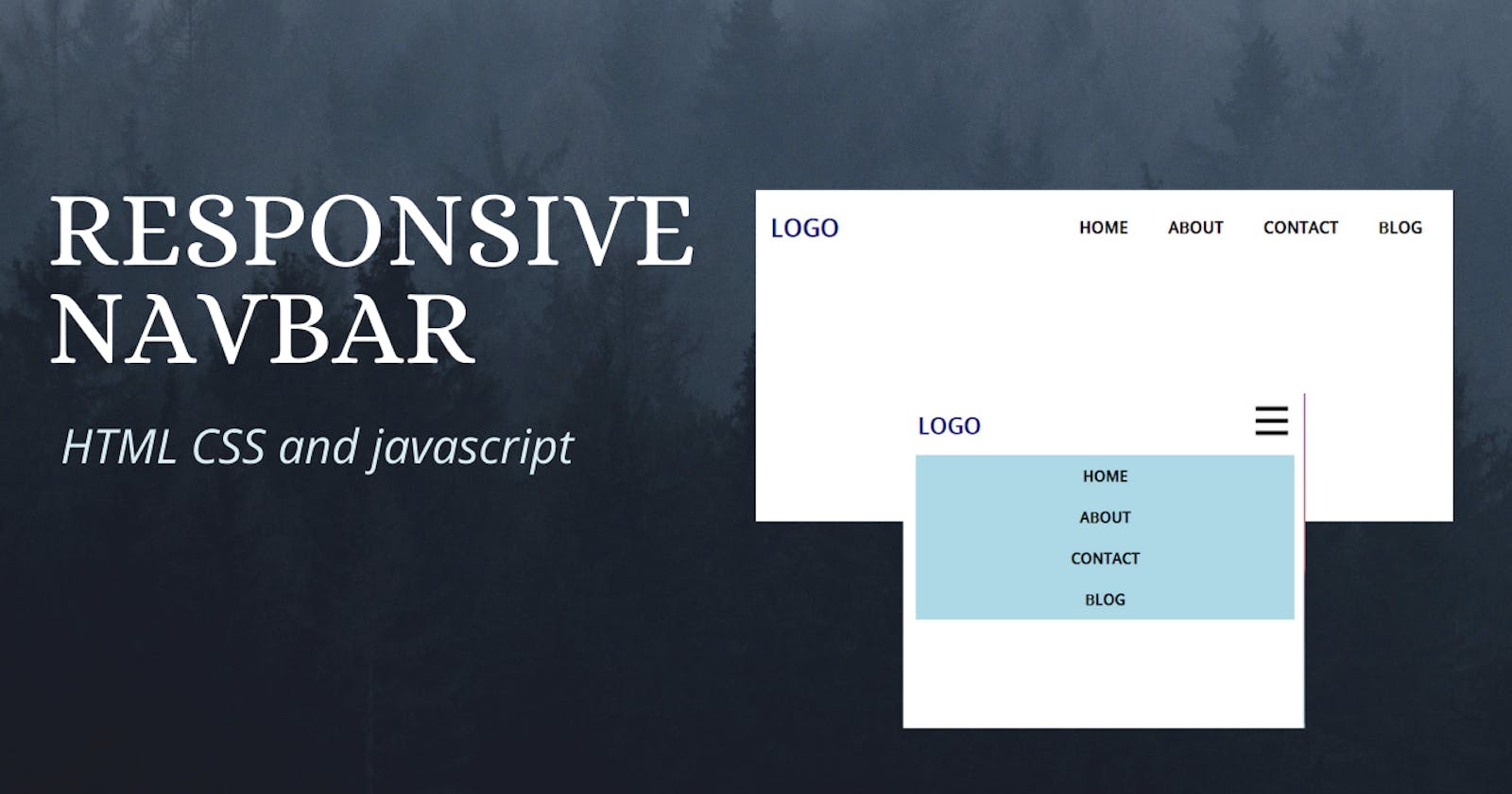
For every CSS project we build, a responsive navigation bar is a must-have.
So, today we are going to build a responsive navigation bar using HTML CSS and vanilla javascript.
Note: It's a Mobile-First design
If you prefer video. I also created a video. You can watch it here
Let's get started 🎉🎉
Part 1: HTML
<!DOCTYPE html>
<html lang="en">
  <head>
    <meta charset="UTF-8" />
    <meta http-equiv="X-UA-Compatible" content="IE=edge" />
    <meta name="viewport" content="width=device-width, initial-scale=1.0" />
    <link rel="stylesheet" href="styles.css" />
    <title>responsive navbar</title>
  </head>
  <body>
    <header>
      <nav class="nav">
        <a href="/" class="logo">logo</a>

        <div class="hamburger">
          <span class="line"></span>
          <span class="line"></span>
          <span class="line"></span>
        </div>

        <div class="nav__link hide">
          <a href="#">home</a>
          <a href="#">about</a>
          <a href="#">contact</a>
          <a href="#">blog</a>
        </div>
      </nav>
    </header>
  </body>

  <script src="./script.js"></script>
</html>
Above we got our navbar's markup with a hamburger.
I linked the CSS and javascript files too.
Let's see how we can style this markup with CSS
Part: 2 CSS
* {
  box-sizing: border-box;
  margin: 0;
  padding: 0;
}

body {
  font-family: sans-serif;
}

a {
  text-decoration: none;
  color: black;
  font-size: 1.2rem;
  font-weight: bold;
  text-transform: uppercase;
}
Here, we removed some of the default styles and added some styles to the a tag.
/* nav styles */

.nav {
  display: flex;
  justify-content: space-between;
  align-items: center;
  padding-top: 20px;
}

.logo {
  font-size: 1.8rem;
  color: rgb(5, 5, 116);
  padding-left: 20px;
}

.hamburger {
  padding-right: 20px;
  cursor: pointer;
}

.hamburger .line {
  display: block;
  width: 40px;
  height: 5px;
  margin-bottom: 10px;
  background-color: black;
}

.nav__link {
  position: fixed;
  width: 94%;
  top: 5rem;
  left: 18px;
  background-color: lightblue;
}

.nav__link a {
  display: block;
  text-align: center;
  padding: 10px 0;
}

.nav__link a:hover {
  background-color: lightcoral;
}

.hide {
  display: none;
}
This is the main design. Here we styled our navbar the hamburger and the logo.
The mobile design is done.

We are going to look at the desktop design now.
@media screen and (min-width: 600px) {
  .nav__link {
    display: block;
    position: static;
    width: auto;
    margin-right: 20px;
    background: none;
  }

  .nav__link a {
    display: inline-block;
    padding: 15px 20px;
  }

  .hamburger {
    display: none;
  }
}
In the desktop design, we removed the absolute position and made it a display block. And to the nav__link's we added display inline-block so that the links say next to each other. Lastly, added display none to the .hamburger

One last thing is left. Now we need to make our hamburger clickable.
Part 3 : Javascript
const hamburger = document.querySelector('.hamburger');
const navLink = document.querySelector('.nav__link');

hamburger.addEventListener('click', () => {
  navLink.classList.toggle('hide');
});
Here we added a click event to the hamburger and added the classList.toggle to the navLink.
What the classList.toggle does is, it removes the class if the given class is available and add's if it's not available.
source code: github.com/Coderamrin/responsive-navbar-css..
Live preview: coderamrin.github.io/responsive-navbar-css-js
Conclusion
Thanks for reading.
If you liked it don't forget to follow me amrin
also, I've started a YouTube channel where I share programming tutorials and videos. If that sounds great check it out: youtube.com/channel/UCiHUi4wJ6rkPSQ5n4bxKU1A
Have a good one :D
