This is Build 10 CSS project in 10 days series. In this series, I will build 10 CSS projects in 10 days.
I will be using vanilla CSS for the projects.
This is Project 1 and Day 1.
##Project 1: 3-column preview card component
Project 1 is from frontend mentor challenges. It is 3-column preview card component project
Today's project is built with vanilla CSS.
Before starting, download the starter files from the frontend mentor And extract/unzip it.
Part 1: HTML
The main goal of this series is to learn to build CSS projects. So, we won’t go into every detail of HTML. So, I'll just paste it here.
<body>
  <div class="cardContainer">
    <div class="card card--orange">
      <img src="images/icon-sedans.svg" class="card__icon">
      <h1 class="card__title">Sedans</h1> <p class="card__description">
          Choose a sedan for its affordability and excellent fuel economy. Ideal for cruising in the cityor on your next road trip.
      </p>
      <button class="btn btn--orange">
        Learn More
      </button>
    </div>

    <div class="card card--cyan">
      <img src="images/icon-suvs.svg" class="card__icon" >
      <h1 class="card__title">SUVS</h1> <p class="card__description">
          Take an SUV for its spacious interior, power, and versatility. Perfect for your next family vacation and off-road adventures.
      </p>
      <button class="btn btn--cyan">
        Learn More
      </button>
    </div>

    <div class="card card--d-cyan">
      <img src="images/icon-luxury.svg" class="card__icon">
      <h1 class="card__title">Luxury</h1> <p class="card__description">
          Cruise in the best car brands without the bloated prices. Enjoy the enhanced comfort of a luxury rental and arrive in style.
      </p>
      <button class="btn btn--d-cyan">
        Learn More
      </button>
    </div>
  </div>
</body>
Part 2: CSS
Here comes css.
One quick note inside the starter files you downloaded there is a file name “syle-guide.md”. This file contains all the color and fonts we need.
We are now going to import the fonts from google fonts
@import url('https://fonts.googleapis.com/css2?family=Big+Shoulders+Display:wght@700&family=Lexend+Deca&display=swap');
Let's add some global styles
/*global styles*/
* {
    margin: 0;
    padding: 0;
    box-sizing: border-box;
}

body, html {
    height: 100%;
}

body {
    font-size: 15px;
    display: flex;
    justify-content: center;
    align-items: center;
    flex-direction: column;
}
We just removed all the margin and padding from everything with the * (global) selector. And senterd everything vertically and horizontally using flex box.
/*variables*/
:root {
    --orange: hsl(31, 77%, 52%);
    --dark-cyan: hsl(184, 100%, 22%);
    --v-dark-cyan: hsl(179, 100%, 13%);

    --t-white: hsla(0, 0%, 100%, 0.75);
    --light-gray: hsl(0, 0%, 95%);
}
For ease of use we just extract all the colors from “syle-guide.md” and create css variables.
/*card styles */
.cardContainer {
    display: flex;
    width: 690px;
    line-height: 1.5;
}

.card {
    background-color: var(--dark-cyan);
    padding: 28px;
}

.card__title {
    color: var(--light-gray);
    text-transform: uppercase;
    font-family: 'Big Shoulders Display', cursive;
}

.card__description {
    color: var(--t-white);
    line-height: 1.8;
}
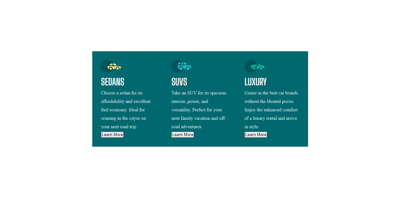
We give the cardContainer to display flex to align the cards next to one another. And added fixed width 690px
Then styled the card. Added padding of 28px to make space inside the card. Styled the cardtitle and carddescription. Added colors and some text styles.
This is how it looks.
/*btn styles*/

.btn {
    border: 0;
    padding: 10px 25px;
    border-radius: 5rem;
    margin-top: 3rem;
    border: 2px solid var(--t-white);
    cursor: pointer;
}

.btn--orange {
    color: var(--orange);
}

.btn--cyan {
    color: var(--dark-cyan);
}

.btn--d-cyan {
    color: var(--v-dark-cyan);
}

.card__icon,
.card__title,
.card__description,
.btn {
    margin-bottom: 1rem;
    font-family:'Lexend Deca', sans-serif;
}

.btn:hover {
    border: 2px solid var(--t-white);
    background: 0;
    color: var(--t-white);
}
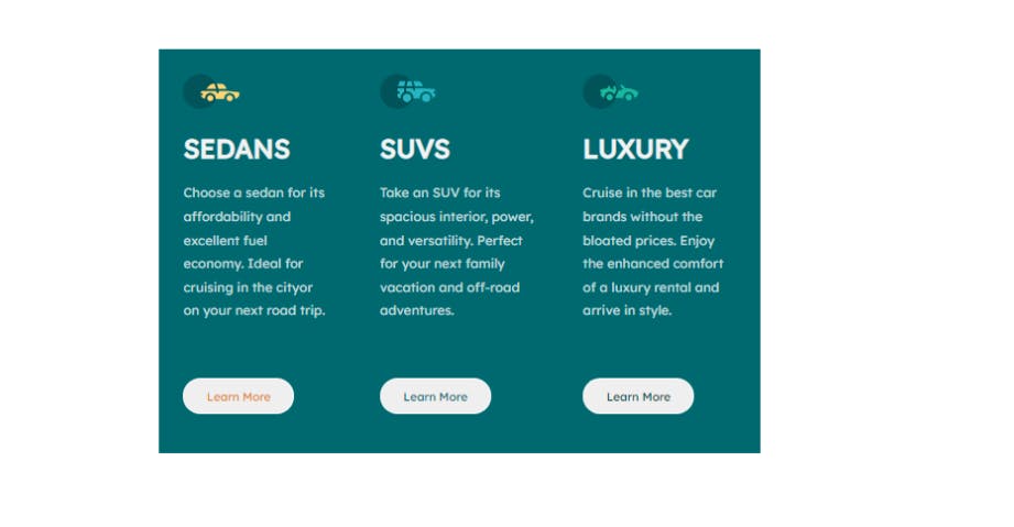
Styled the buttons. Added padding and border and border-radius to make the rounded style. And added different colors to individual buttons. Also added hover effect. On hover, the background changes to 0 which is another way of saying none.
This is how it looks
/*card backgrounds*/
.card--orange {
    background: var(--orange);
    border-top-left-radius: .5rem;
    border-bottom-left-radius: .5rem;
}

.card--cyan {
    background: var(--dark-cyan);
}

.card--d-cyan {
    background: var(--v-dark-cyan);
    border-top-right-radius: .5rem;
    border-bottom-right-radius: .5rem;
}
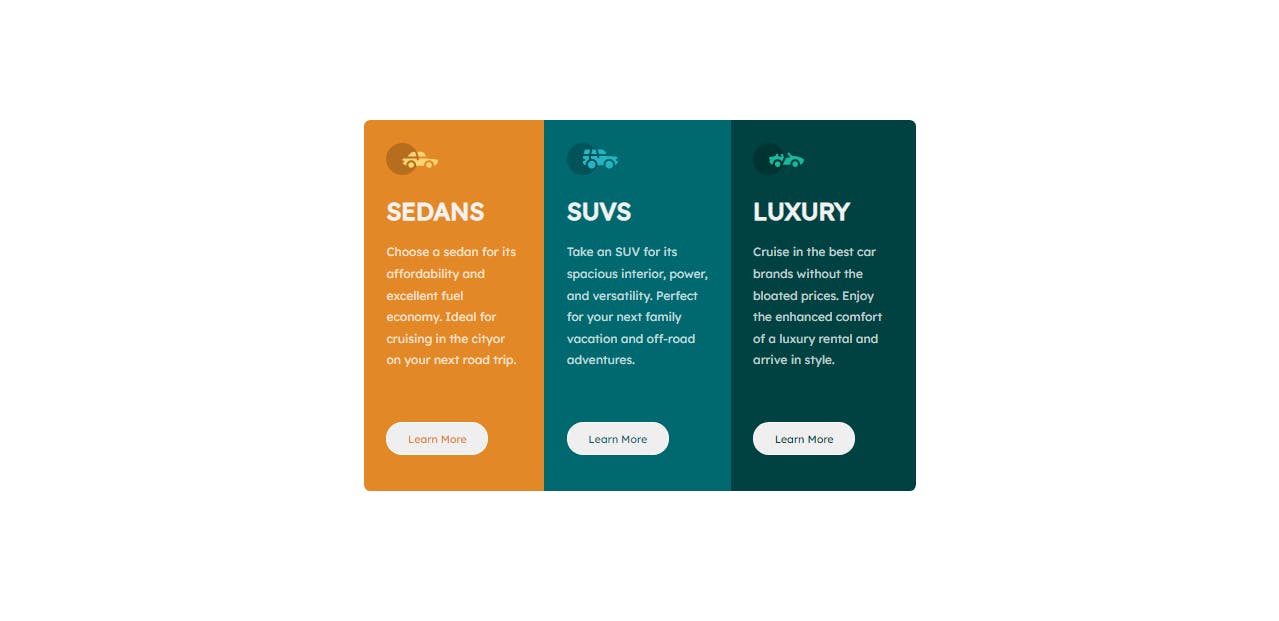
Changed the background of each card to match the design.
And this is how the desktop design looks.
/*media query for smaller screen*/
@media screen and (max-width: 728px) {
    .cardContainer {
        width: 250px;
        flex-direction: column;
        height: 100%;
    }

    .card {
        padding: 30px;
    }

    .card--orange {
        border-top-left-radius: 0;
        border-bottom-left-radius: 0;
    }

    .card--d-cyan {
        border-top-right-radius: 0;
        border-bottom-right-radius: 0;
    }
}
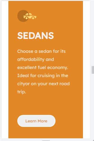
This is the Mobile design. The Responsive design part. In this one, we changed the cardContainer class to flex-direction column. That stack one card on top of another one. And removed the border radius of the middle cards.
This is how it looks on the mobile
Source code: github.com/Coderamrin/3_column_card_component
Live Preview: coderamrin.github.io/3_column_card_component
This is for today's Project. If you have any questions and suggestions let me know in the comment below. I will be more than happy to talk to you.
If you like this type of content and want more of these. Consider Following me at @coderamrin
Thanks for Reading.
