Welcome to my "Build 10 CSS Projects in 10 Days" Series
This is day 4 and project 4. If you haven't read the other articles in this series please check them out first. I'll list them at the end of this article.
Today I will build Single Price Grid Component from frontendmentor
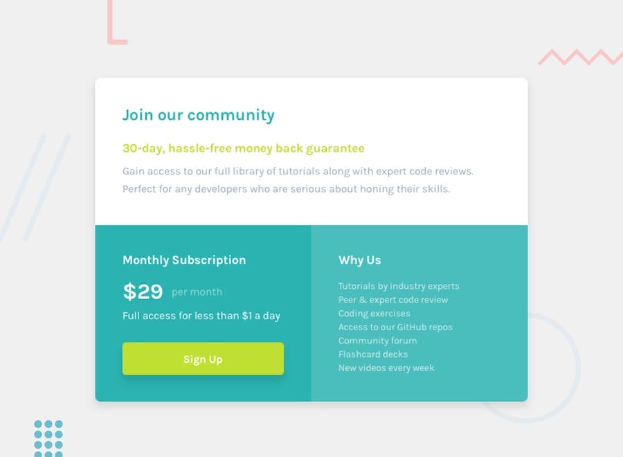
Download The Starter Files
Frontendmentor provides a starter file for every project. so, before starting download the project starter file from here from frontendmentor
Open the starter file in your favourite code editor and let's start coding.
Part 1: HTML
<body>
<main class="container">
<section class="top">
<h1>Join our community</h1>
<h2>30-day, hassle-free money back guarantee</h2>
<p>
Gain access to our full library of tutorials along with expert code
reviews. Perfect for any developers who are serious about honing their
skills.
</p>
</section>
<section class="bottom">
<div class="left">
<h2>Monthly Subscription</h2>
<div><span class="big">$29</span> <span>per month</span> </div>
<p>Full access for less than $1 a day</p>
<button>Sign Up</button>
</div>
<div class="right">
<h2>Why Us</h2>
<ul>
<li>Tutorials by industry experts</li>
<li>Peer & expert code review</li>
<li>Coding exercises</li>
<li>Access to our GitHub repos</li>
<li>Community forum</li>
<li>Flashcard decks</li>
<li>New videos every week</li>
</ul>
</div>
</section>
</main>
</body>
This is the whole markup.
Part 2: CSS
@import url('https://fonts.googleapis.com/css2?family=Karla:wght@400;700&display=swap');

/* global styles */
* {
    box-sizing: border-box;
    font-family: 'Karla', sans-serif;
}

body {
    margin: 0;
    display: flex;
    justify-content: center;
    align-items: center;
    height: 100vh;
    background: hsl(204, 43%, 93%);
}
Here we imported the font from google font. And added box-sizing border-box for every element. And used flexbox on the body to center everything horizontally and vertically on the web page.
/* main design */
.container {
    width: 680px;
    max-width: 100%;
    box-shadow: 0 14px 28px rgba(0,0,0,0.10), 0 10px 10px rgba(0,0,0,0.10);
}

h2 {
    font-size: 21px;
}
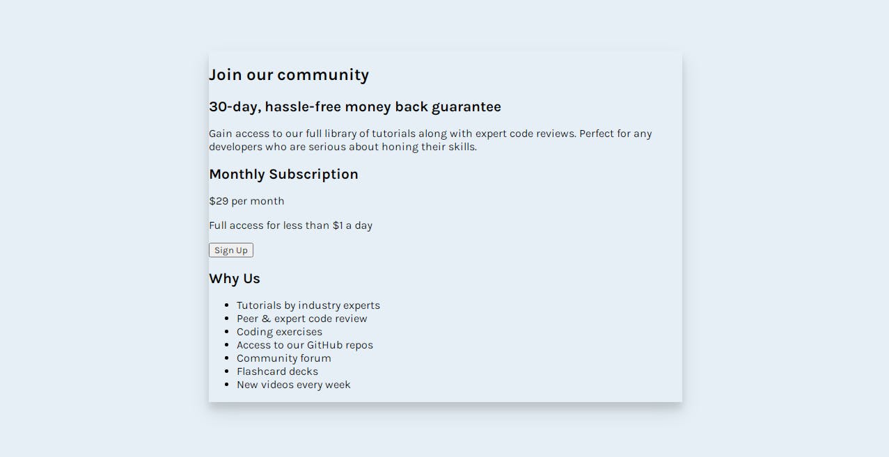
We gave the container a fixed width of 680px and added a box-shadow.
This is how it looks
/* top styles */
.top {
    background: #fff;
    padding: 40px 30px;
    border-top-left-radius: 5px;
    border-top-right-radius: 5px;
}

h1 {
    color: hsl(179, 62%, 43%);
}

.top h2 {
    color: hsl(71, 73%, 54%);
}

.top p {
    color: hsl(218, 22%, 67%);
    line-height: 1.6;
    font-size: 18px;
}
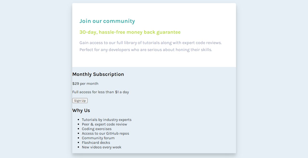
Here we gave the top background color white, and some padding. After that style the header and paragraph.
/* bottom styles */
.bottom {
    color: #fff;
    display: flex;
}

p, ul {
    opacity: .7;
}

/* left */

.left {
    background: hsl(179, 62%, 43%);
    flex: 1;
    padding: 40px 30px;
    border-bottom-left-radius: 5px;
}

.left span.big {
    font-size: 50px;
    font-weight: 700;
    color: #fff;
    opacity: 1;
    margin-right: 10px;
}

button {
    width: 100%;
    border: 0;
    background: hsl(71, 73%, 54%);
    padding: 15px 0;
    font-size: 20px;
    color: #fff;
    font-weight: 700;
    border-radius: 5px;
    margin-top: 20px;
}
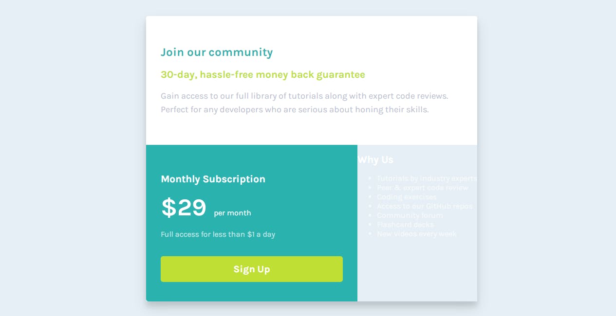
We added display flex to the bottom section so the left and right stack next to each other. After that, we styled the left section.
/* right */

.right {
    background: hsl(179, 62%, 46%);
    flex: 1;
    padding: 40px 30px;
    border-bottom-right-radius: 5px;
}

ul {
    list-style-type: none;
    padding: 0;
}

li {
    line-height: 1.7;
}
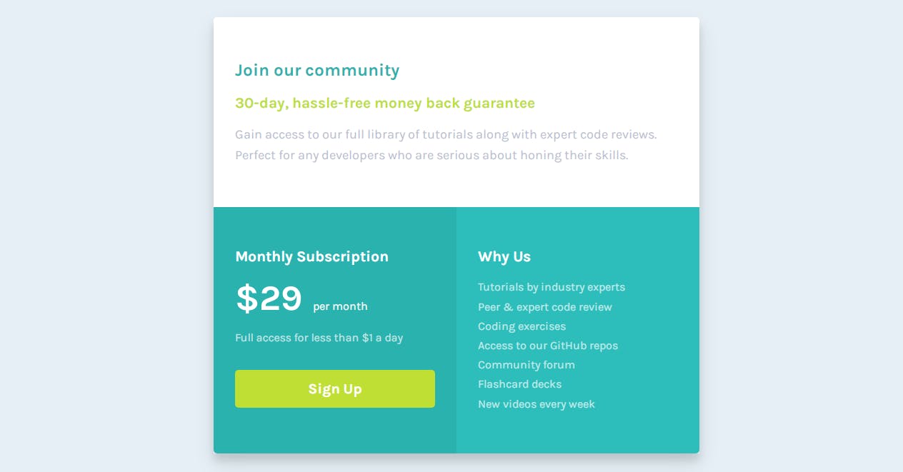
In this snippet, we styled the bottom right section and styled the list.
This is the desktop design.
Now we are going to design the mobile version.
@media screen and (max-width:800px) {
    body {
        height: auto;
    }

    .top,
    .left,
    .right {
        border-radius: 0;
    }

    .bottom {
        display: block;
    }
}
in the mobile version, we just removed the display flex of the bottom section to the display block so the left and right say top of one another.

Last Article of This series
Conclusion
Thanks for reading. If you like this post and want more like this one consider following. And if you want to know what I post follow me on Twitter at @coderamring
