Welcome to my CSS project blog series.
This is day 7 and project 7 of Build 10 CSS Projects in 10 days. If you haven't read the other articles from this series, check them out first. You can find them at the end of this article.
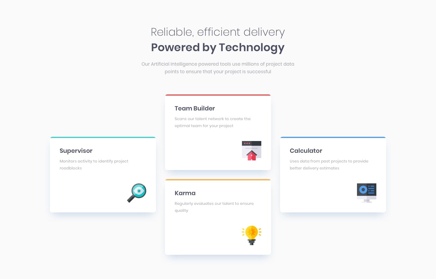
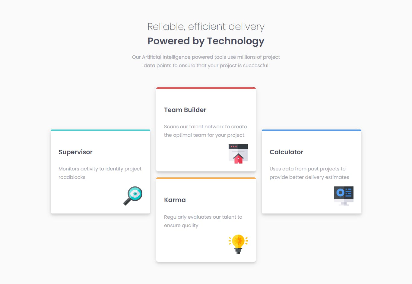
Today we are going to build "Four card feature section " from the Frontendmentor

Before starting:
- Download the starter files from here
- Open the starter files on your code editor.
- Create a style.css file and link it to the HTML file
- And check out the style-guide.md file
We are done with the setup. Let's finish this project.
Part 1: HTML
<!DOCTYPE html>
<html lang="en">
  <head>
    <meta charset="UTF-8" />
    <meta name="viewport" content="width=device-width, initial-scale=1.0" />
    <!-- displays site properly based on user's device -->

    <link
      rel="icon"
      type="image/png"
      sizes="32x32"
      href="./images/favicon-32x32.png"
    />
    <link rel="stylesheet" href="style.css">
    <title>Frontend Mentor | Four card feature section</title>
  </head>
  <body>
    <div class="container">
      <header>
        <h2 class="light">Reliable, efficient delivery</h2>
        <h2>Powered by Technology</h2>
        <p>
          Our Artificial Intelligence powered tools use millions of project data
          points to ensure that your project is successful
        </p>
      </header>

      <div class="card-container">
        <div class="card supervisor">
          <h4>Supervisor</h4>
          <p>Monitors activity to identify project roadblocks</p>
          <img src="./images/icon-supervisor.svg" alt="" class="icon" />
        </div>
        <div class="card teamBuilder">
          <h4>Team Builder</h4>
          <p>
            Scans our talent network to create the optimal team for your project
          </p>
          <img src="./images/icon-team-builder.svg" alt="" class="icon" />
        </div>
        <div class="card calculator">
          <h4>Calculator</h4>
          <p>
            Uses data from past projects to provide better delivery estimates
          </p>
          <img src="./images/icon-calculator.svg" alt="" class="icon" />
        </div>
        <div class="card karma">
          <h4>Karma</h4>
          <p>Regularly evaluates our talent to ensure quality</p>
          <img src="./images/icon-karma.svg" alt="" class="icon" />
        </div>
      </div>
    </div>
  </body>
</html>
Part 2: CSS
 @import url('https://fonts.googleapis.com/css2?family=Poppins:wght@200;400;600&display=swap');

 * {
     box-sizing:  border-box;
 }

 body {
     margin: 0;
     padding: 0;
     font-family: 'Poppins', sans-serif;
     background-color: hsl(0, 0%, 98%);
 }

p {
    color: hsl(229, 6%, 66%);
    line-height: 1.8;
}

h2,
h4 {
    color: hsl(234, 12%, 34%);
}
This snippet is the global style. First, we imported the font from google font. Then applied it to the body. And then styled the p and h2, h4.
/* main styles */

.container {
    max-width: 1100px;
    width: 100%;
    margin: 0 auto;
    padding: 4rem 0;
    display: flex;
    justify-content: center;
    flex-direction: column;
}

header {
    text-align: center;
    width: 500px;
    margin: auto;
    padding-bottom: 2rem;
}

h2 {
    margin: 0;
    font-size: 2rem;
}

h2.light {
    font-weight: 300;
}
In this part, we style the container and the header. To the container, we added a fixed max-width of 1100px and a width of 100%. Also, we centered the container with the flexbox.
And to the header titles, we gave them a big font size and made the other one light.

.card-container {
    display: flex;
    flex-wrap: wrap;
    justify-content: center;
}

.card {
    width: 330px;
    background-color: #fff;
    margin: 10px;
    padding: 26px;
    box-shadow: 0 5px 20px rgba(0,0,0,0.1), 0 6px 6px rgba(0,0,0,0.1);
    border-radius: 5px;
}

.card h4 {
    font-size: 1.3rem;
}

img {
    display: block;
    margin-left: auto;
}

.supervisor {
    border-top: 5px solid hsl(180, 62%, 55%);
}

.teamBuilder {
    border-top: 5px solid hsl(0, 78%, 62%);
}

.karma {
    border-top: 5px solid hsl(34, 97%, 64%);
}

.calculator {
    border-top: 5px solid hsl(212, 86%, 64%);
}

.supervisor,
.calculator {
    transform: translateY(50%);
}
In this part, we style the cards and this is the last part.
First, we gave the card-container display flex so the cards sit next to each other, not on top of each other.
And after that, we styled the card. We gave the card fixed width and some margin and padding to make some space inside and outside the card and, some box-shadow to make a nice effect. Then we styled the card title and the card image. At last, we added the border top to each card. And to the last and first card added transform so they get 50% down.

With that we finished the desktop design, now comes the mobile part.
@media screen and (max-width:700px) {
    header {
        width: 80%;
    }

    h2 {
        font-size: 1.5rem;
    }

    .supervisor,
    .calculator {
        transform: translateY(0%);
    }
}
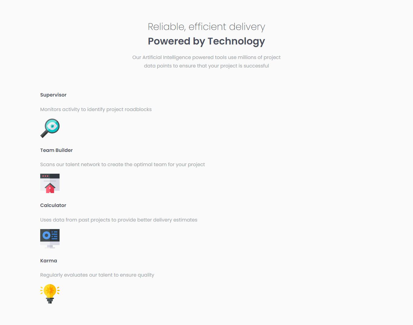
For the mobile style, we just decreased the header width to 80%. And made the headers a little smaller. Also removed the transform so, the cards don't overlap on top of one another.

Conclusion
That's it for today's project. If you liked the article and want more articles like this one consider following me at amrin. You can also connect with me on Twitter @coderamrin
Thanks for reading.
