Build 10 CSS Projects in 10 days: Project 8

This is day 8 and project 8 of Build 10 CSS Projects in 10 days. If you haven't read the other articles from this series, check them out first. You can find them at the end of this article.
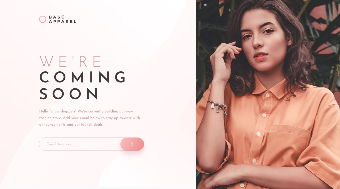
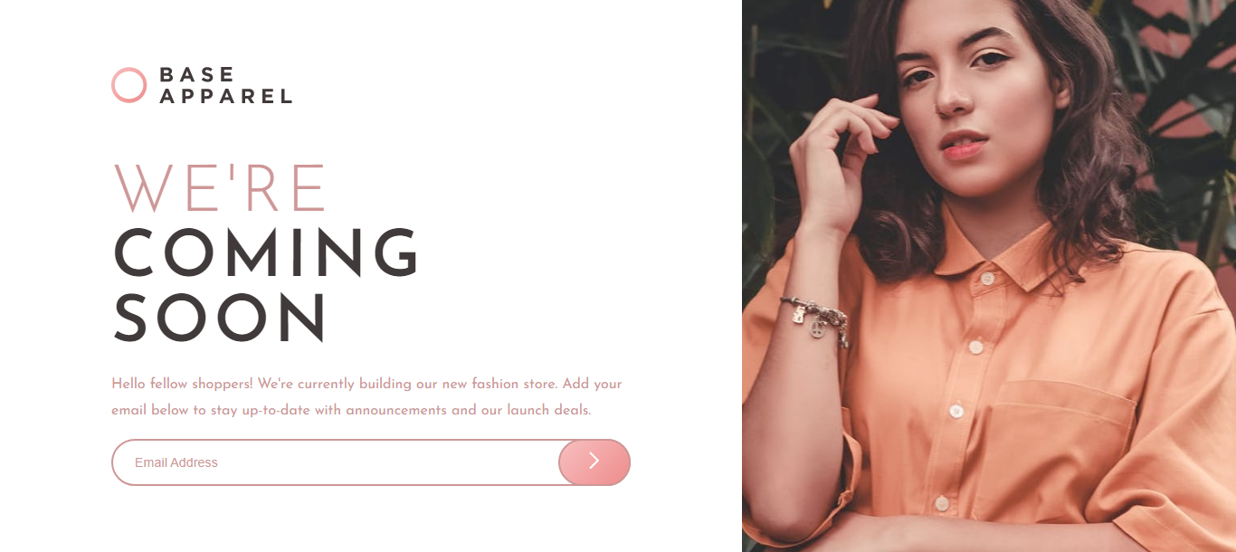
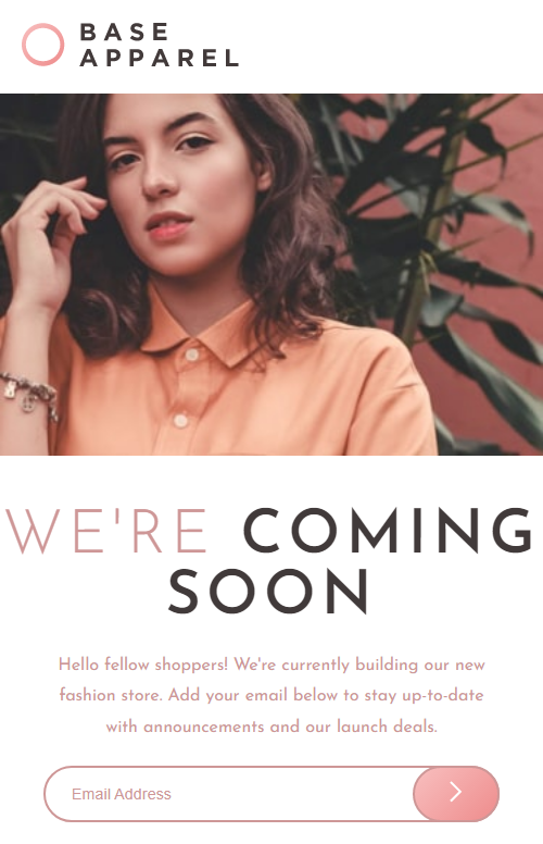
Today we are going to build "Base Apparel coming soon page " from the Frontendmentor
Before starting:
- Download the starter files from here)
- Open the starter files on your code editor.
- Create a style.css file and link it to the HTML file
- And check out the style-guide.md file
Part 1: HTML
<!DOCTYPE html>
<html lang="en">
  <head>
    <meta charset="UTF-8" />
    <meta name="viewport" content="width=device-width, initial-scale=1.0" />
    <!-- displays site properly based on user's device -->

    <link
      rel="icon"
      type="image/png"
      sizes="32x32"
      href="./images/favicon-32x32.png"
    />

    <title>Frontend Mentor | Base Apparel coming soon page</title>
    <link rel="stylesheet" href="style.css" />
  </head>
  <body>
    <main class="container">
      <section class="left">
        <div class="inner">
          <img src="./images/logo.svg" alt="logo" class="logo" />
            <img src="./images/hero-mobile.jpg" alt="hero-mobile" class="mobile-hero">
          <h1><span>We're</span> coming soon</h1>
          <p>
            Hello fellow shoppers! We're currently building our new fashion store.
            Add your email below to stay up-to-date with announcements and our
            launch deals.
          </p>
          <form>
            <input type="email" placeholder="Email Address" />
            <button><img src="./images/icon-arrow.svg" alt="" /></button>
          </form>
        </div>
      </section>
      <section class="right desktop-hero"></section>
    </main>
  </body>
</html>
This is the HTML, copy and paste it. And scan through it once, so that you know what we will be styling.
Part 2: CSS
@import url('https://fonts.googleapis.com/css2?family=Josefin+Sans:wght@300;400;600&display=swap');

* {
    box-sizing: border-box;
}

body {
    font-family: 'Josefin Sans', sans-serif;
    margin: 0;
    padding: 0;
}
First, we imported the font from google fonts. Then added a box-sizing border-box to every element so the border and padding stay inside the width.
After that, we added the font to the body and removed margin and padding.
/* main style */
.container {
    display: flex;
    justify-content: center;
    align-items: center;
    height: 100vh;
}

.left {
    width: 60%;
}

/* right */
.desktop-hero {
    background: url("./images/hero-desktop.jpg") center no-repeat;
    background-size: cover;
    width: 40%;
    height: 100vh;
}
Here, we centred the container with flex box. Then, gave the left section width of 60% and right section width of 40%. And added the background image to the right section.
.inner {
    width: 70%;
    margin: 0 auto;
}

.logo {
    width: 200px;
}

.mobile-hero {
    display: none;
}

h1 {
    font-size: 4.5rem;
    text-transform: uppercase;
    letter-spacing: 5px;
    color: hsl(0, 6%, 24%);
    margin-bottom: 0;
}

h1 span {
    font-weight: 300;
    color: hsl(0, 36%, 70%);
}

p {
    line-height: 1.8;
    color: hsl(0, 36%, 70%);
}

form {
    position: relative;
}

input {
    width: 100%;
    padding: 1rem 1.5rem;
    outline: none;
    border: 2px solid hsl(0, 36%, 70%);
    border-radius: 5rem;
    font-size: .9rem;
}

input::placeholder {
    color: hsl(0, 36%, 70%);
}

button {
    position: absolute;
    top: 0;
    right: 0;
    height: 100%;
    padding: .5rem 2rem;
    border-radius: 5rem;
    border: 2px solid hsl(0, 36%, 70%);
    background-image: linear-gradient(135deg, hsl(0, 80%, 86%), hsl(0, 74%, 74%) );
}
In this part, we removed the mobile-hero, so it just shows up on mobile. After that, we styled the title, paragraph, and form.
@media screen and (max-width:900px) {
    .container {
        height: auto;
        margin: auto;
    }

    .left {
        width: 100%;
    }

    .inner {
        width: 100%;
        margin: auto;
    }

    h1 {
        font-size: 3.5rem;
        text-align: center;
    }

    p, form {
        margin: 20px 40px;
        text-align: center;
    }

    .logo {
        margin: 20px;
        text-align: left;
    }

    .desktop-hero {
        display: none;
    }

    .mobile-hero {
         display: block;
         width: 100%;
    }
}
This is the mobile design. In here we removed the fixed height of the container. And made the title and paragraph a little smaller. And removed the desktop hero and inserted the mobile hero.
Conclusion
That's it for today's project. If you liked the article and want more articles like this one consider following. You can also connect with me on Twitter @coderamrin
Thanks for reading.


