This is day 9 and project 9 of Build 10 CSS Projects in 10 days. If you haven't read the other articles from this series, check them out first. You can find them at the end of this article.
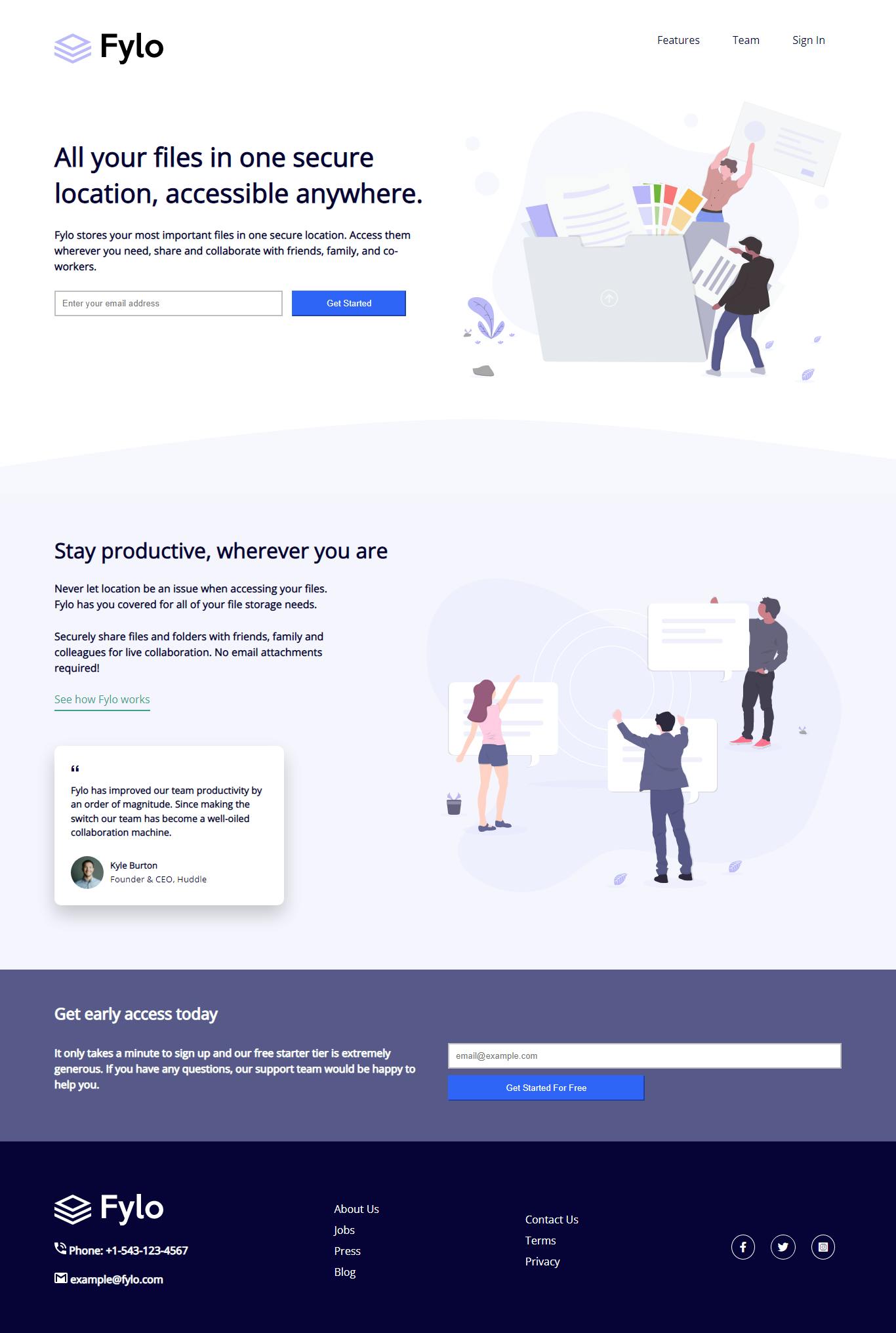
Today we are going to build "Fylo landing page with two column layout " from the Frontendmentor
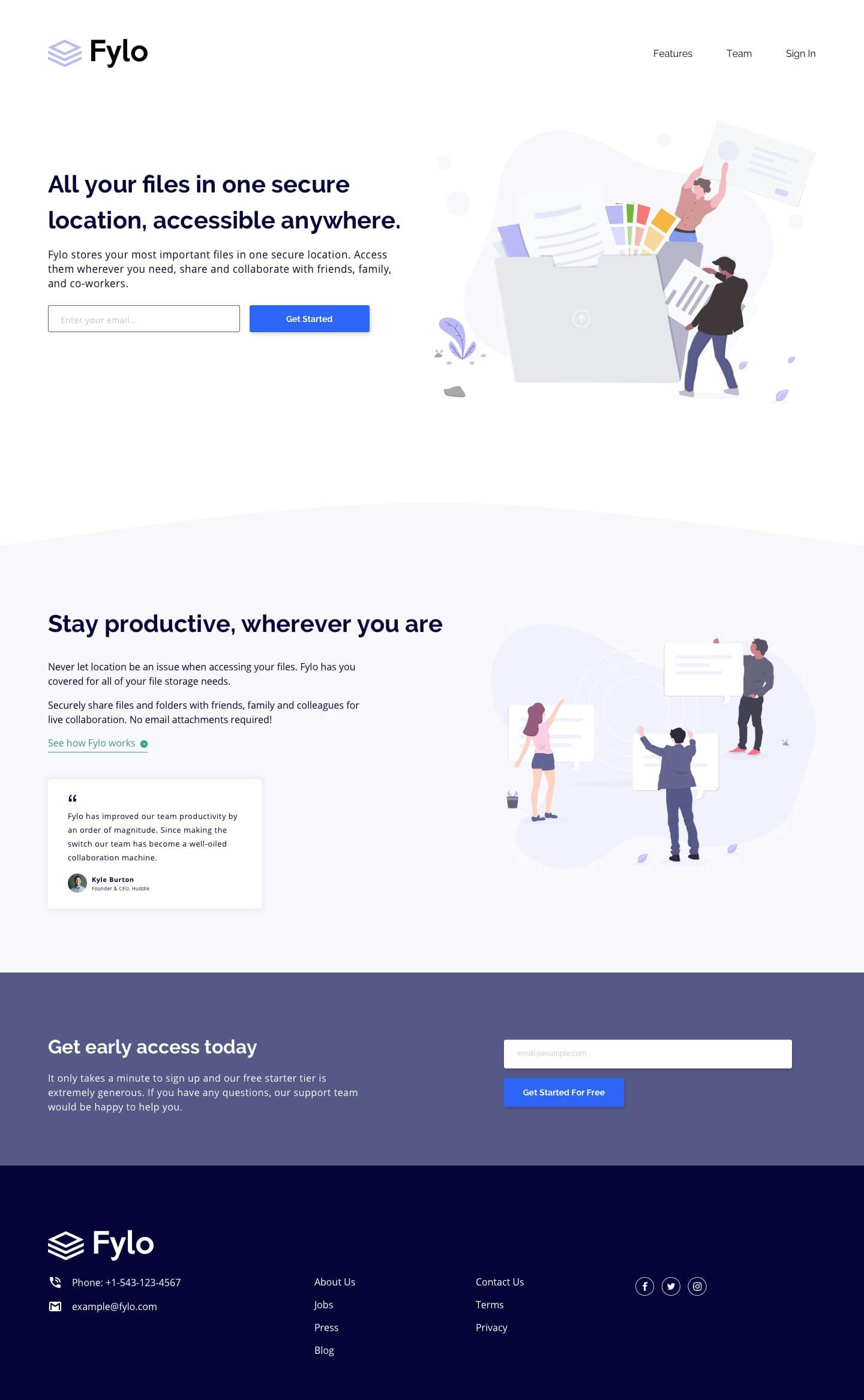
Before starting:
- Download the starter files from here
- Open the starter files on your code editor.
- Create a style.css file and link it to the HTML file
- And check out the style-guide.md file
Part 1: HTML
<!DOCTYPE html>
<html lang="en">
  <head>
    <meta charset="UTF-8" />
    <meta name="viewport" content="width=device-width, initial-scale=1.0" />
    <!-- displays site properly based on user's device -->

    <link
      rel="icon"
      type="image/png"
      sizes="32x32"
      href="./images/favicon-32x32.png"
    />
    <link
      rel="stylesheet"
      href="https://cdnjs.cloudflare.com/ajax/libs/font-awesome/6.0.0-beta2/css/all.min.css"
    />
    <link rel="stylesheet" href="style.css" />

    <title>Frontend Mentor | Fylo landing page with two column layout</title>
  </head>
  <body>
    <header class="container">
      <nav>
        <a href="#"><img src="./images/logo.svg" alt="logo" /></a>
        <ul>
          <li><a href="#">Features</a></li>
          <li><a href="#">Team</a></li>
          <li><a href="#">Sign In</a></li>
        </ul>
      </nav>
      <div class="hero">
        <section class="left">
          <h1>All your files in one secure location, accessible anywhere.</h1>
          <p>
            Fylo stores your most important files in one secure location. Access
            them wherever you need, share and collaborate with friends, family,
            and co-workers.
          </p>

          <form>
            <input type="Email" placeholder="Enter your email address" />
            <button>Get Started</button>
          </form>
        </section>

        <section class="right">
          <img src="./images/illustration-1.svg" alt="illustration-1" />
        </section>
      </div>
    </header>
    <section class="section-1">
      <div class="container section-container">
        <section class="left">
          <h2>Stay productive, wherever you are</h2>
          <p>
            Never let location be an issue when accessing your files. Fylo has
            you covered for all of your file storage needs.
          </p>
          <p>
            Securely share files and folders with friends, family and colleagues
            for live collaboration. No email attachments required!
          </p>
          <a href="#" class="section-2-btn">See how Fylo works</a>

          <div class="box">
            <p>
              Fylo has improved our team productivity by an order of magnitude.
              Since making the switch our team has become a well-oiled
              collaboration machine.
            </p>
            <div class="author">
              <img src="./images/avatar-testimonial.jpg" alt="" />
              <div class="info">
                <h5>Kyle Burton</h5>
                <small>Founder & CEO, Huddle</small>
              </div>
            </div>
          </div>
        </section>
        <section class="right">
          <img src="./images/illustration-2.svg" alt="illustration-2" />
        </section>
      </div>
    </section>
    <section class="section-2">
      <div class="container section-container">
        <section class="left">
          <h3>Get early access today</h3>
          <p>
            It only takes a minute to sign up and our free starter tier is
            extremely generous. If you have any questions, our support team
            would be happy to help you.
          </p>
        </section>
        <section class="right">
          <form action="">
            <input type="email" placeholder="email@example.com" />
            <button>Get Started For Free</button>
          </form>
        </section>
      </div>
    </section>
    <footer>
      <div class="container footer-container">
        <div>
          <img src="./images/logo-white.svg" alt="logo" />
          <p>
            <img src="./images/icon-phone.svg" alt="Phone" /> Phone:
            +1-543-123-4567
          </p>
          <p>
            <img src="./images/icon-email.svg" alt="email" /> example@fylo.com
          </p>
        </div>

        <div>
          <ul>
            <li><a href="#">About Us</a></li>
            <li><a href="#">Jobs</a></li>
            <li><a href="#">Press</a></li>
            <li><a href="#">Blog</a></li>
          </ul>
        </div>

        <div>
          <ul>
            <li><a href="#">Contact Us</a></li>
            <li><a href="#">Terms</a></li>
            <li><a href="#">Privacy</a></li>
          </ul>
        </div>
        <div class="social-icons">
          <i class="fab fa-facebook-f"></i>
          <i class="fab fa-twitter"></i>
          <i class="fab fa-instagram-square"></i>
        </div>
      </div>
    </footer>
  </body>
</html>
As always we are not going to go deeper into the markup. Just scan through it and copy it over to your code editor.
Part 2: CSS
Now we are going to style this landing page.
@import url("https://fonts.googleapis.com/css2?family=Open+Sans&family=Raleway:wght@400;700&display=swap");

/*
font-family: 'Raleway', sans-serif;  */

* {
  box-sizing: border-box;
  margin: 0;
  padding: 0;
}

body {
  font-family: "Open Sans", sans-serif;
  color: hsl(243, 87%, 12%);
}

.container {
  width: 1200px;
  max-width: 90%;
  margin: 0 auto;
  padding: 50px 0;
}

a {
  text-decoration: none;
  color: hsl(243, 87%, 12%);
}
In this part, we added some global styles.
First, we imported the font from google font. Then, we added box-sizing and removed margin and padding from every element. After that, we styled the container, gave it a fixed width of 1200px a max-width of 90% so it styes in nicely without overflowing.
At last, we styled the a tag. We removed the underline and changed the color.
/* header styles */

nav {
  display: flex;
  justify-content: space-between;
}

nav ul {
  display: flex;
}

nav li {
  list-style: none;
  margin: 0 25px;
}
In this section, we styled the navigation. We gave the nav element display flex so the navigation items sit next to each other.
Then we added display flex to the ul element. So that, the li stay next to each other.
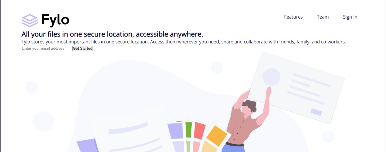
/* hero styles */
.hero {
  display: flex;
  align-items: center;
  margin-bottom: 5rem;
}

.hero > section {
  flex: 1;
}

h1 {
  font-size: 2.5rem;
  margin-bottom: 25px;
}

p {
  font-weight: 600;
  line-height: 1.5;
  margin-bottom: 25px;
}

.left {
  padding-right: 40px;
}

input,
button {
  padding: 10px 10px;
}

form input {
  width: 60%;
  border: 2px solid hsl(0, 0%, 75%);
}

form button {
  width: 30%;
  margin-left: 10px;
  background-color: hsl(224, 93%, 58%);
  border-color: hsl(224, 93%, 58%);
  color: #fff;
}

.right {
  padding-top: 50px;
}

.right img {
  width: 100%;
}
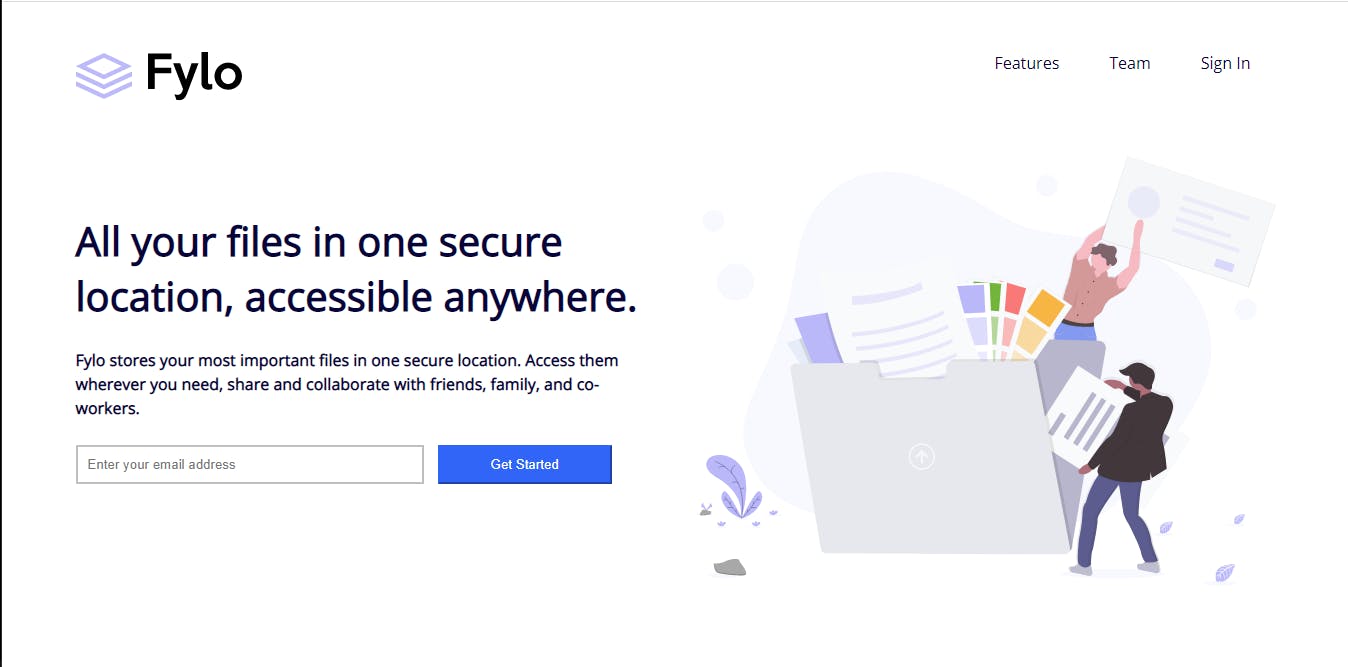
Here, we styled the hero section. First, we added display flex to the hero, so the sections stay next to each other. Then, with added flex 1 to all the sections of hero, so each section takes 50% of the space.
After that, we styled the title and description. It's just some basic styles, increased the font size to match the style and some margin to make some space.
Then added some padding to the left section. After that, we styled the form input and gave the right sections image width of 100%.
This is what we got.
/* section-1 styles */

.section-1 {
  padding: 3rem 0;
  background-color: hsl(240, 75%, 98%);
  position: relative;
}

.section-1::before {
  content: " ";
  width: 100%;
  height: 100%;
  background: url("./images/bg-curve-desktop.svg") no-repeat;
  position: absolute;
  top: -80px;
  left: 0;
}

.section-container {
  display: flex;
}

h2 {
  font-size: 2rem;
  padding-bottom: 25px;
}

.section-1 p {
  width: 80%;
}

.section-1 a {
  color: hsl(170, 45%, 43%);
  border-bottom: 2px solid;
  padding-bottom: 5px;
}
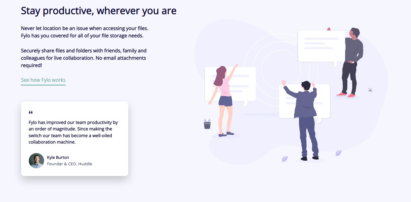
Here, we styled the section-1 section. Added background color. Then added the curve on top of the section. After that added display flex to the .section-container, and styled the title and description.
.box {
  background-color: #fff;
  width: 350px;
  padding: 25px;
  margin-top: 60px;
  border-radius: 10px;
  box-shadow: 0 14px 28px rgba(0, 0, 0, 0.2), 0 10px 10px rgba(0, 0, 0, 0);
}

.box p {
  width: 100%;
  font-size: 0.9rem;
}

.box .author {
  display: flex;
  align-items: center;
}

.author img {
  border-radius: 50%;
  width: 50px;
  height: 50px;
  margin-right: 10px;
}

.box::before {
  content: url("./images/icon-quotes.svg");
  margin-bottom: 10px;
  display: inline-block;
}
In this section, we styled the testimonial card.
/* section 2 */
.section-2 {
    background: hsl(238, 22%, 44%);
    color: #fff;
}

.section-container {
    align-items: center;
}

.section-2 .left {
    width: 50%;
}

.section-2 .left h3 {
  font-size: 1.5rem;
  padding-bottom: 2rem;
}

.section-2 .right {
    width: 50%;
}

.section-2 form {
    display: flex;
    flex-direction: column;
}

.section-2 input {
    width: 100%;
    margin-bottom: 10px;
}

.section-2 button {
    margin: 0;
    width: 50%;
}
In this part, we styled the section-2 section. First, we added the background color and color to this section. Then added made the .left and right section width of 50%. Then, styled the title and description. And at the end, we styled the form.

/* footer */
footer {
  background: hsl(243, 87%, 12%);
  color: #fff;
}

.footer-container {
  display: flex;
  justify-content: space-between;
  align-items: center;
  padding-top: 5rem;
}

footer ul li {
  list-style-type: none;
  margin-bottom: 10px;
}

footer ul li a {
  color: #fff;
}

.footer-container div > * {
  margin-bottom: 20px;
}

.social-icons .fab {
  margin: 0 10px;
  padding: 10px;
  border: 1px solid #fff;
  border-radius: 50%;
}

.social-icons .fa-facebook-f {
  padding: 10px 12px;
  display: inline-block;
}
Now comes the footer. At first, we changed the background, then added display flex to the footer container, so the sections stack next to each other. After that, we styled the lists and the social icons.
Note: In the footer, we got the logo in white color. But frontend mentor didn't provide it. I changed the color. So, check out the source code link, I'll upload it there.

/* mobile styles */
@media screen and (max-width: 1000px) {
  nav img {
    width: 100px;
  }

  nav li {
    list-style: none;
    margin: 0 8px
  }

  .hero {
    flex-direction: column;
    text-align: center;
  }

  .hero .right {
    order: -1;
    padding-bottom: 5rem;
  }

  /* sections */
  .section-container {
    flex-direction: column;
  }

  .section-1  p {
    width: 100%;
  }

  .box {
    margin: 4rem auto;
  }

  .left {
    padding-right: 0;
  }

  .section-2 .left {
    width: 100%;
  }

  .section-2 .right {
    width: 100%;
  }

  .section-2 button {
    width: 100%;
  }

  form button, form input{
    width: 100%;
    margin: 10px 0;
  }

  .footer-container {
    flex-direction: column;
    align-items: flex-start;
  }

  footer div {
    margin-bottom: 2rem;
  }

}
In the mobile styles, All we did is made every container flex-direction column, so the layout becomes one column. And then adjusted the margin, padding, and font size to fit the screen.

Conclusion
That's it for today's project. If you liked the article and want more articles like this one consider following me at coderamrin. You can also connect with me on Twitter @coderamrin
Thanks for reading.
