

Welcome to my “build 10 CSS projects in 10 days" series. In this series, I will build 10 CSS projects in 10 days.
This is day 2 and Project 2.
If you haven’t read the first article, then I recommend that you check that one first.
I will put the link at the end of this article.
Project 2: Social Proof Section
Today I am going to build this “Social Proof Section” component from the frontend mentor challenges. I am going to use vanilla CSS for this project.
Before starting you will have to download the starter files from here.
Create a style.css file and link to the HTML file.
And open it on your favorite text editor.
The setup is complete. Let's make our hands dirty with CSS.
Part 1: HTML
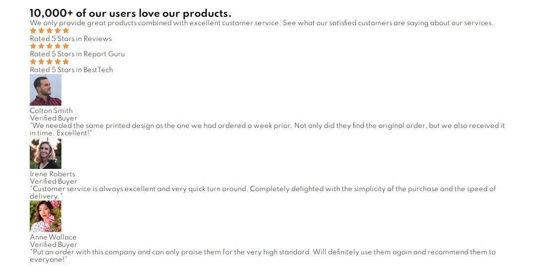
So, we are not gonna do the HTML part as always. I am just going to paste it here. Just copy and paste it and scan through it. Because we are going to style these markups.
  <body>
    <div class="container">
      <div class="top">
        <section class="left">
          <h1>10,000+ of our users love our products.</h1>
          <p>
            We only provide great products combined with excellent customer service.
            See what our satisfied customers are saying about our services.
          </p>
        </section>

        <section class="right reviews">
          <div class="review">
            <div>
              <img src="./images/icon-star.svg" alt="star">
              <img src="./images/icon-star.svg" alt="star">
              <img src="./images/icon-star.svg" alt="star">
              <img src="./images/icon-star.svg" alt="star">
              <img src="./images/icon-star.svg" alt="star">
            </div>
            <span>Rated 5 Stars in Reviews</span>
          </div>
          <div class="review review-2">
            <div>
              <img src="./images/icon-star.svg" alt="star">
              <img src="./images/icon-star.svg" alt="star">
              <img src="./images/icon-star.svg" alt="star">
              <img src="./images/icon-star.svg" alt="star">
              <img src="./images/icon-star.svg" alt="star">
            </div>
            <span>Rated 5 Stars in Report Guru</span>
          </div>
          <div class="review review-3">
            <div>
              <img src="./images/icon-star.svg" alt="star">
              <img src="./images/icon-star.svg" alt="star">
              <img src="./images/icon-star.svg" alt="star">
              <img src="./images/icon-star.svg" alt="star">
              <img src="./images/icon-star.svg" alt="star">
            </div>
            <span>Rated 5 Stars in BestTech</span>
          </div>
        </section>
      </div>

      <section class="bottom  testimonial-container">
        <div class="testimonial">
          <div class="author">
            <img src="./images/image-colton.jpg" alt="colton">
            <div>
              <p>Colton Smith</p>
              <p class="pink">Verified Buyer</p>
            </div>
          </div>
          <p>
            "We needed the same printed design as the one we had ordered a week prior.
            Not only did they find the original order, but we also received it in time.
            Excellent!"
          </p>
        </div>
        <div class="testimonial testimonial-2">
          <div class="author">
            <img src="./images/image-irene.jpg" alt="Irene">
            <div>
              <p>Irene Roberts</p>
              <p class="pink">Verified Buyer</p>
            </div>
          </div>
          <p>
            "Customer service is always excellent and very quick turn around.
             Completely delighted with the simplicity of the purchase and the speed of delivery."
          </p>
        </div>
        <div class="testimonial testimonial-3">
          <div class="author">
            <img src="./images/image-anne.jpg" alt="anne">
            <div>
              <p>Anne Wallace </p>
              <p class="pink">Verified Buyer</p>
            </div>
          </div>
          <p>
            "Put an order with this company and can only
             praise them for the very high standard.
             Will Definitely use them again and recommend
             them to everyone!"
          </p>
        </div>
      </section>
    </div>
  </body>
Part 2: CSS
Now I am going to style the component.
First, I am going to import the fonts that are given in the Style-guide.md file. From google fonts. And I will take the colors from the style guide and assign them to CSS variables.
@import url('https://fonts.googleapis.com/css2?family=Spartan:wght@400;500;700&display=swap');

/* color variables */
:root {
    --very-dark-magenta: hsl(300, 43%, 22%);
    --soft-pink:hsl(333, 80%, 67%);
    --dark-grayish-magenta: hsl(303, 10%, 53%);
    --light-grayish-magenta: hsl(300, 24%, 96%);
    --white: hsl(0, 0%, 100%);
}
Let's add some global styles.
/*global styles*/

* {
    box-sizing: border-box;
    margin: 0;
}

body {
    font-family: 'Spartan', sans-serif;
    display: flex;
    justify-content: center;
    align-items: center;
    min-height: 100vh;
    font-size: 16px;
}


.container {
    width: 1200px;
    max-width: 100%;
    margin: 0 auto;
    padding: 50px 0;
}
In the global styles. I added box-sizing border box to every element on the webpage. So, the border and padding will be included inside the width of the element.
Added font family to the body and centered everything horizontally and vertically using flexbox. And wrapped everything inside a container
We are going to design the top part now.
.top {
    display: flex;
}

.top > section {
    flex: 1;
}

h1 {
    font-size: 4rem;
    color: var(--very-dark-magenta);
}

p {
    color: var(--dark-grayish-magenta);
    line-height: 1.5;
}
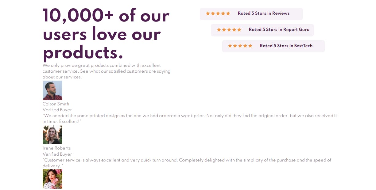
To make the top section 2 columns I gave it display flex. To make equal width each section added flex 1.
/* right styles */

.right {
    padding-left: 80px;
}

.right > div {
    display: flex;
    background: var(--light-grayish-magenta);
    margin-bottom: 15px;
    padding: 15px 0;
    width: 420px;
    border-radius: 10px;
}

.review-2 {
    margin-left: 45px;
}

.review-3 {
    margin-left: 90px;
}

.review div {
    margin-left: 25px;
}

.review span {
    margin-left: 30px;
    color: var(--very-dark-magenta);
    font-weight: 700;
}
Added padding to the right of the “right” section to make a little space. Styled the texts of the review. And stacked them as the design.
/* bottom style */
.bottom {
    display: flex;
    margin-top: 75px;
}

.testimonial {
    background: var(--very-dark-magenta);
    padding: 35px 20px;
    border-radius: 10px;
}

.testimonial p {
    color: var(--light-grayish-magenta);
    line-height: 1.8;
}

.testimonial .author {
    display: flex;
    align-items: center;
    margin-bottom: 30px;
}

.testimonial img {
    border-radius: 50%;
}

.author div {
    margin-left: 20px;
}

.author .pink {
    color: var(--soft-pink);
}
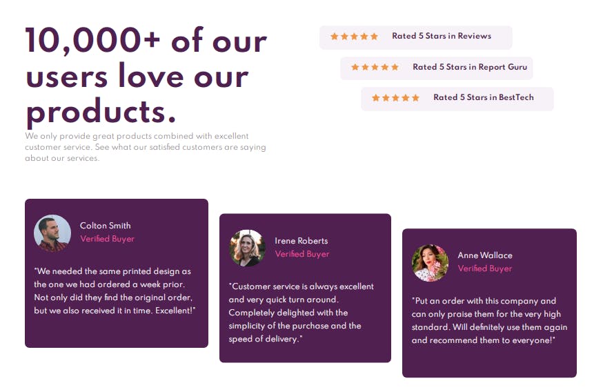
Here we are styling the bottom part.
First giving the bottom display flex. So all the testimonial cards stack side by side.
After the design is we will have to drag the testimonial a little toward the bottom.
.testimonial-2 {
    margin: 0 25px;
    transform: translateY(10%);
}

.testimonial-3 {
   transform: translateY(20%);
}
I used transform translate to drag them.
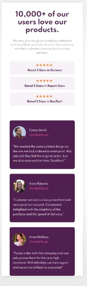
This is how the final desktop design looks. It's pretty tough.
Now we are going to design the mobile version.
@media screen and (max-width: 745px) {

    .container {
        padding: 50px;
    }

    .top {
        text-align: center;
        flex-direction: column;
    }

    h1 {
        font-size: 2.5em;
        margin-bottom: 30px;
    }

    .right {
        padding: 0;
        margin-top: 40px;
    }

    .right > div {
        width: 100%;
    }

    .review {
        margin: 0 auto;
        flex-direction: column;
    }

    .review div {
        margin-bottom: 10px;
    }

    .bottom {
        flex-direction: column;
    }

    .testimonial {
        margin: 0 auto;
    }
}
The mobile design is just one column. So I did flex-direction column and removed the margin and padding of the desktop to make it look good.
This is how it looks on the mobile.
Live Preview: coderamrin.github.io/social-proof-section
Source Code: github.com/Coderamrin/social-proof-section
Previous Posts:
Build 10 CSS projects In 10 Days: project 1
Resources:
Conclusion
If you have any suggestions or requests let me know in the comment below. And if you like this type of article, consider following me at amrin. Thanks for reading.